

Website refresh - part 2
Phase two of the site refresh: QwikCity tested and scrapped, Tina visual editing in Astro, LLM benchmarking, further image optimizations, and a drafted search feature.

My website was fast, really fast! I had spent a lot of time getting it to a perfect Lighthouse score, and for a while that was the thing I was most proud of. While speed is a good metric, I felt that my site was not perhaps up to par anymore from a visual perspective and needed a redesign.
So I gave my Astro-Qwik site another redesign fueled by LLMs. This is how two rounds, ten designs, a lot of front-page tinkering, and a surprisingly friendly block system became the site you're looking at now.
The 2025 refresh was largely about fixing an ageing site and making the new one properly fast. Visually, it still followed the original olli.works design quite closely. The foundations had changed much more than the look. I loved the result, but I had made speed such a big part of its personality that the visual side was rather barebones. The content outside the blog also needed an update to better reflect what I do today.
Speed is still important. It just isn't the sexiest story on its own anymore, especially when an LLM can help almost anyone spot and fix the obvious performance problems. I wanted the site to show a bit more taste and personality while still being quick to use.
In my last website update I mentioned trying redesign ideas that didn't really feel like me. I wasn't going to ship one just because it looked shiny in a screenshot. This time I kept going until it felt right.
I wanted a fresh look, but I also had a pretty clear list of things to keep in mind:
Basically, give the site a new outfit without needing to replace the core skeleton.
I used OpenAI GPT-6.1 Sol with some extra skills to give it a better starting point:
I wanted clearer content in my own voice, so I used the parts that fit a personal site.
Inspired by Theo Browne, I tasked the LLM with making five redesign variations as static HTML pages I could open and compare. The brief was that each new version had to look substantially different from the previous one. I ran that twice, giving me ten directions to choose from. Keeping the demos as plain HTML saved tokens before committing to an actual Astro-Qwik implementation. Most didn't feel like me. Some looked interesting, but looked like a completely different person's portfolio.
The plan was to choose a direction, bring over the parts of the old site that already worked, and implement only the front page first: render, look, tweak, repeat. I wanted to get one real page right before changing the shared blocks across the site.
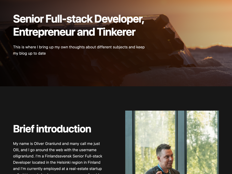
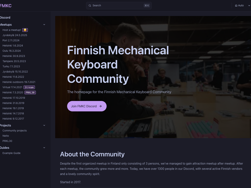
Below are three of those experiments: the editorial, workbench, and field journal directions. Seeing them with my own photos and projects made it much easier to decide what felt right and what didn't.
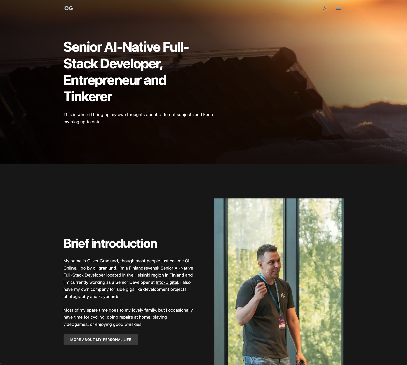
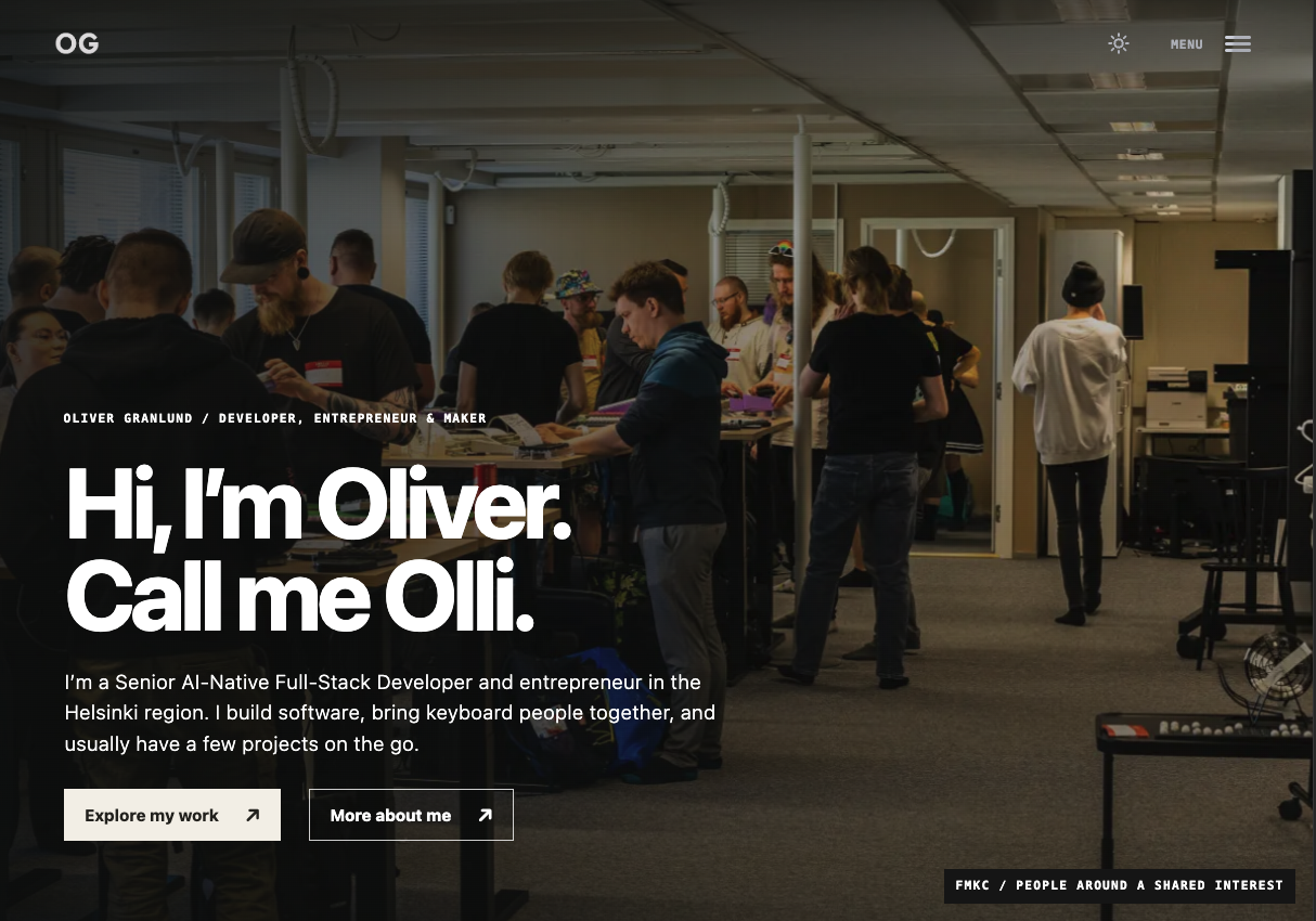
The photographic direction finally felt like me. It gave my own photos more room and brought the development work, keyboard community, and personal side together. I picked the features I liked best and gave that version one final redesign improvement run.
Ten candidates and one final pass on the chosen one.
With the photographic direction chosen, I moved from the HTML demo into the actual front page. Seeing it with real content and the existing components made it easier to judge the details and fine-tune them.
I also set my own specifications for the microanimations. The agent tried to remake the light/dark switch animation, but my old hand-made version was better than the one-shot attempts. I kept it as it was.
The site is built from reusable content blocks. A banner, an image beside text, a single column of prose, a feed of posts: pages are mostly different arrangements of the same pieces. When I had the new visual direction, I could improve those pieces and have the design reach the other pages without rebuilding every page separately.
A component-based architecture with very few variants makes larger changes like this a breeze. There aren't ten slightly different versions of the same card hiding across the site. Adjust the shared component, and every page using it gets the update. Keeping the blocks consistent paid off here.
The data structures stayed almost identical, which also meant I could keep my existing content and TinaCMS editing setup. This is one of those decisions that only starts to feel clever when you need to change everything later.
I also felt that some of the old copy sounded a bit childish. There was junk I didn't need anymore, and parts that didn't say much about what I actually do. I removed the fluff and rewrote the main pages to sound more professional and reflect my current work. Still me, just with a little less rambling.
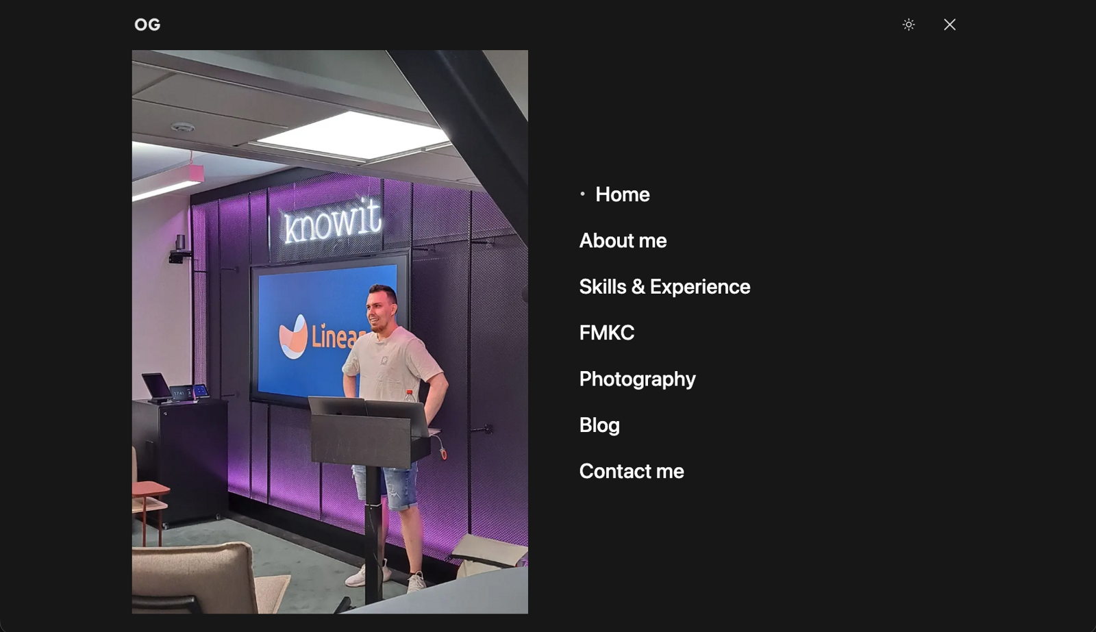
After the big pieces were in place, I added the smaller details: gentle animations, a few touches of movement, and the menu text animation. I updated the menu previews too, so opening the navigation feels like part of the same site rather than a forgotten drawer.
Graceful animations don't have to clog performance. I kept the movement restrained and optimized, with Qwik handling the interactive parts without making the whole page wait for JavaScript. The movement should feel natural, respect reduced-motion settings, and stay out of the way when someone just wants to read.
GPT-6.1 Sol helped with most of the implementation, and for the most part it went smooth as butter. A few times it overcooked a solution and I had to step in and tell it exactly how to implement it more simply. I still had to go through the code and point out what needed changing.
Below are the old and new menus. The event photo stayed, but the layout, previews, and little details got some love.
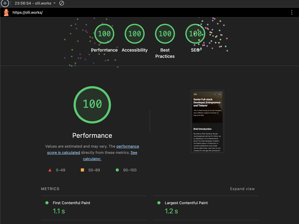
I ran mobile Lighthouse tests on the old and new versions. Both screenshots show 100 for Performance, Accessibility, Best Practices, and SEO, plus 3/3 for Agentic Browsing. That was the goal: make the site feel fresher without giving up the scores I had worked for.
Here are the numbers from those two runs, side by side. You can open the screenshots below if you want to squint at the details yourself.
The LCP went from 1.5 to 1.6 seconds, so the largest visible image or text block appeared 0.1 seconds later in the new run. That is a small step backwards on this particular metric, although changing the layout can also change which element gets measured. LCP doesn't tell the whole loading story by itself.
A nicer site, with more movement, but faster visual progress? The more interesting change is the Speed Index: 1.9 down to 1.0 seconds, a 0.9-second improvement, or about 47% lower. This measures how quickly the page fills in visually during loading. So the new design made faster visual progress in this test, even though its largest element appeared a fraction later. First Contentful Paint stayed at 1 second, and Total Blocking Time dropped from 10 ms to zero.
While working on the redesign, I noticed we were using the wrong Qwik loading setting for this site. I turned off speculative JavaScript preloading, so interaction bundles load when needed instead of being downloaded ahead of time. That leaves less upfront work competing with the visible content. The simpler hero helped too. These two runs don't tell me exactly how much each change contributed.
So even with more joyful visuals, some thoughtful planning kept the performance score high.
Keeping the site fast was part of the brief from the start. A few simple principles helped:
Nothing too fancy under the hood. A simpler implementation left room for a more interesting design.
I'm much happier opening my own website now. It still has the same flexible foundation, but the presentation and content feel closer to where I am today. The part I'd repeat next time is simple: explore a few different directions, get one real page right, then let the shared blocks carry it across the site. And keep checking what the agent builds, especially when it starts making a small thing complicated.
Wonder what the next improvement run brings and towards what direction trends are heading. 🤔
Phase two of the site refresh: QwikCity tested and scrapped, Tina visual editing in Astro, LLM benchmarking, further image optimizations, and a drafted search feature.
My old website had flaws. See how I rebuilt my entire site from Hugo to a new Astro/Qwik stack, fixing broken services and hitting perfect Lighthouse score.
A quick project to make a website for the Finnish Mechanical Keyboard Community to have a proper place to host information about the community.